Perhaps i am using it wrong, but i am trying to organize myself by favoriting tasks from multiple lists so that i have an overview on what i want to do next in the favorite list. However i am struggeling because:
- it feels crowded/cramped because there is no margin above and below tasks
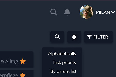
- there seems to be no way to sort them (i dont want to filter them)… i would at least expect a sorting by priority and/or by list
I could be wrong but i just felt like it changed the order just from navigating (cant reproduce tho)
It should use the same view for favorites as for lists, which shouldn’t look cramped. Can you share a screenshot of what you mean?
The api is capable of that, I’m just not sure how we could incorporate this into the frontend from a ui/ux perspective.
I am sorry, that wasn’t ideal wording on my side… it is indeed the same as for lists and not broken. But thats one reason why i prefer the kanban view - because there is more spacing between the tasks and i am in control of their order. I think leaving a little space between each entry, such as with the actionbuttons on the right, when opening the modal of a task (task.detail), could be a nice enhancement.
Maybe just like this, but the active dropdown should be brighter than passive elements:
Maybe just a modal like filter … multiple choice might be good.^^ For example TickTick has two options behind that button: Group by and Sort by, and then things like Lists, Tags, Priority, Name, Time.
There could be a bigger spacing between each group, maybe a headline or/and hr too.
Viewing Tasks from Favorites or Filters in a Kanban board is something we have on the radar. As for the spacing, that’s more of a personal preference and unlikely to change - sorry. You might get away with overriding the spacing with a userstyles browser plugin or similar.
I like that idea. We might do something similar in the future.
2 Likes
