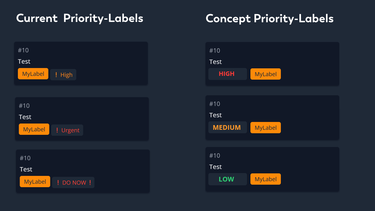
Coming from Focalboard, I really miss how bold and strong the colors were. It made it easier to look at kanban boards, because it was enough to seek for colors rather than read text. I especially liked this for the Priorities.
Here is a comparison of a Focalboard Board recreated in Vikunja:
I can understand that some people might prefer this more subtle approach, but I felt like it was easier on my eyes to have everything color coded so strongly. And currently the priorities below HIGH are not even showing in the frontend for Vikunja.
How important this is to me and why
This to me personally is very important, as this is holding me back from switching to Vikunja, being a Focalboard user. If the current userbase prefers the more subtle approach, it could be implemented as a setting turned off by default.
Importance: Medium
Use cases:
Easier accessible (for example people with Dyslexia)
More colorful (subjective opinion)
Setting Priorities is more useful
Additional context/similar features
Any examples of good implementations of this capability.
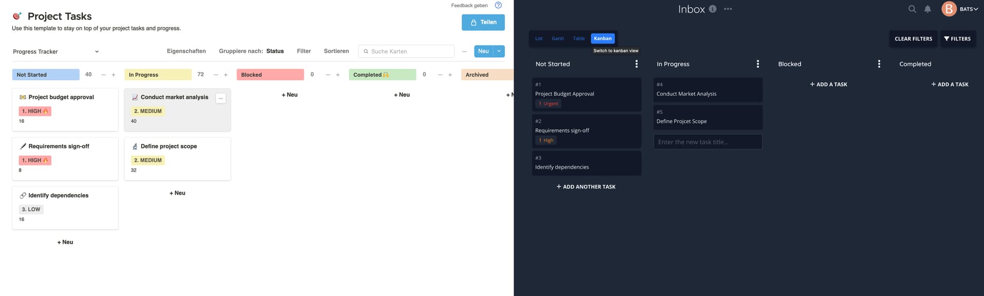
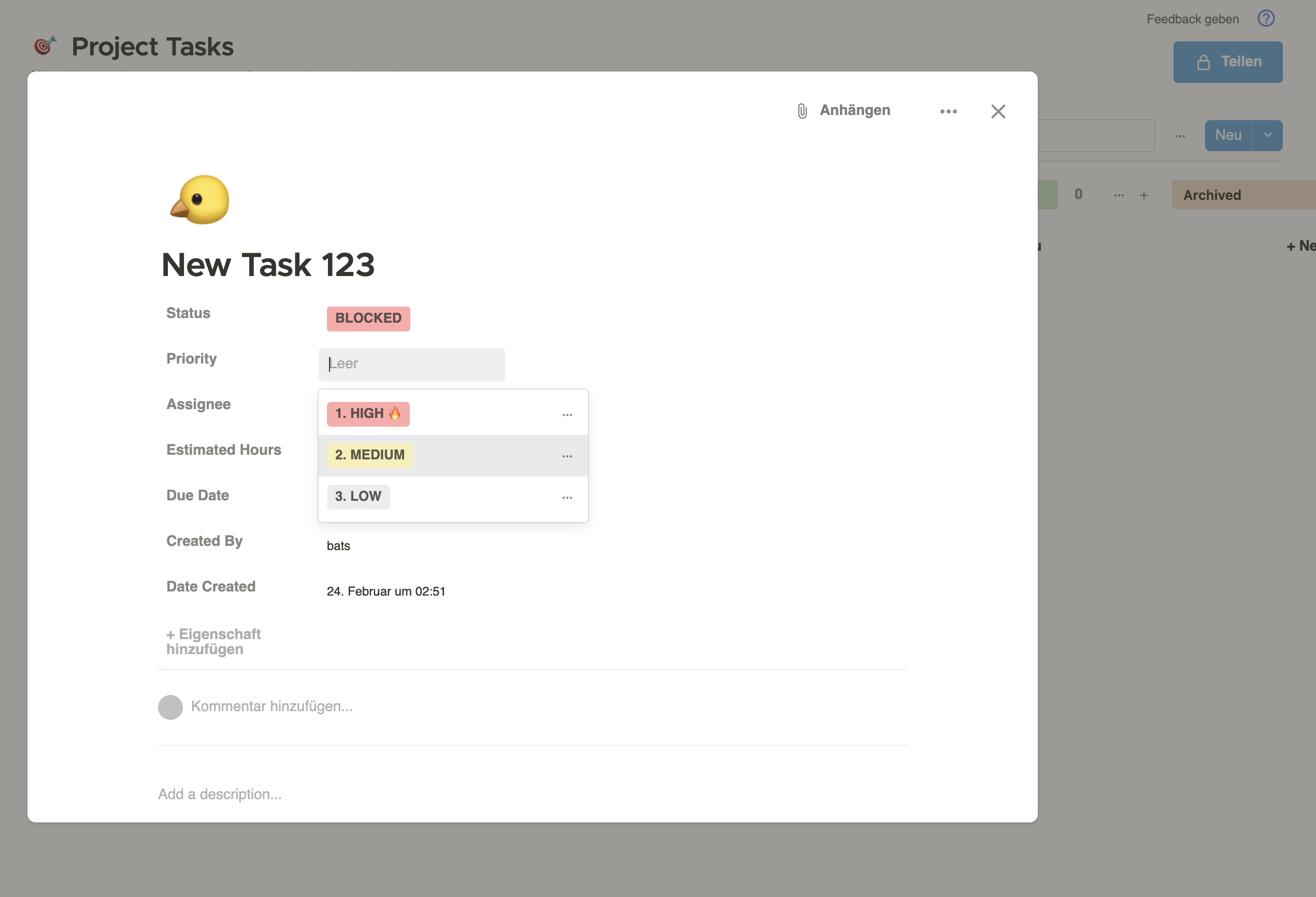
With this implemented, it could also be a good idea to lean more into the priority feature of Vikunja, as it would be more useful. Focalboard makes it really really easy to set the Priority for a new Task as it is within the same window where you also enter the task name. For Vikunja its a few clicks away. After typing the name for the task you need to then click on the newly created task, find the priority section, and select one out of 6 priorities. The amount of pre-set priorities could also be reduced to 3 (maybe 4). This, too, could be changed by the user in the settings of a project in vikunja.
The priorities could be made more colorful, to make them more visible. We would need a way to balance that with the colors of any labels the task may be having, so that a brightly-colored priority is still distinctable from other labels.
Where do the colors for the titles come from in focalboard? Are they set by the user or automatically added when a board is created?
The 3 priorities can not be changed by the user (I think, I haven’t used focalboard for that long). By default a task has no priority, and instead of the colorful priority-label there is nothing.
Edit: installed focalboard again, I had only 7 seconds in the gif, but this is how you can add and change the Priorities. There is a set of predefined colors, but you can add or delete however you feel like.
(second reply so I can add another picture because im a new user)
I find it easier to choose between 3 priorities than having 6, that just feels overwhelming and too much.
If you want to keep the current color palette of the labels (having the same background as the site-background), you could do something like this: