Distinguish sidebar from main UI and logo padding

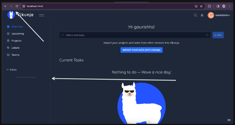
hi! i feel like the main user interface and sidebar should be distinguishable either with different colours or having a border. for example:

The logo seems to not have enough upper padding as well
These are minor UI changes i would be up to open a PR.

I’d love a PR for these, at best split into seperate PRs for each change.

That was different in the past and should look the way you’re describing. The logo and menu icon should be aligned with the icons on the right and the title (if any) though