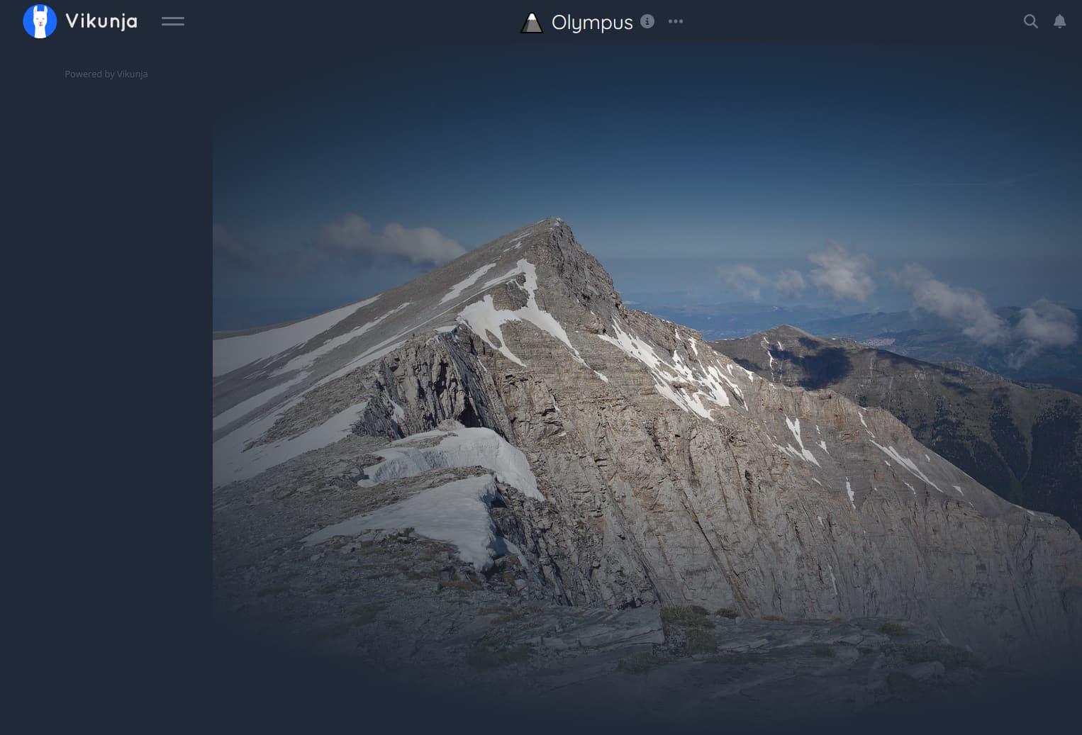
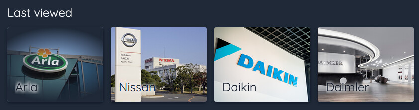
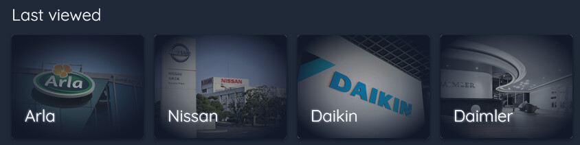
Hello, I’ve had a go at ‘improving’ the project backgrounds by adding colour overlay for smoother transitions, and improving the project card text shadow.
It has been driving me mad, so I thought some of you may make use of it.
I’m sure it could be improved, but I’m happy with this.
/* Apply gradient to task screen background for smoother transition */
#app div.app-container-background:after {
    content: "";
    display: block;
    position: absolute;
    top: 0;
    left: 0;
    width: 100%;
    height: 100%;
    background: radial-gradient(ellipse at 60% 50%, transparent 0%, #1f2937 70%);
}

/* Apply gradient to project tiles */
li.project-grid-item div.project-background:after {
    content: "";
    display: block;
    position: absolute;
    top: 0;
    left: 0;
    width: 100%;
    height: 100%;
    background: radial-gradient(ellipse at center, #1f293761 0%, #1f293799 40%, #111827 85%);
}

/* Apply better shadow over project tile titles, fix text cropping */
li.project-grid-item div.project-title,
li.project-grid-item .has-background div.project-title {
    text-shadow: 1px 1px 2px hsl(220, 13%, 50%),-1px -1px 2px hsl(220, 13%, 50%);
    color: white;
    padding: 3px 3px;
}