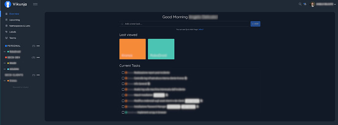
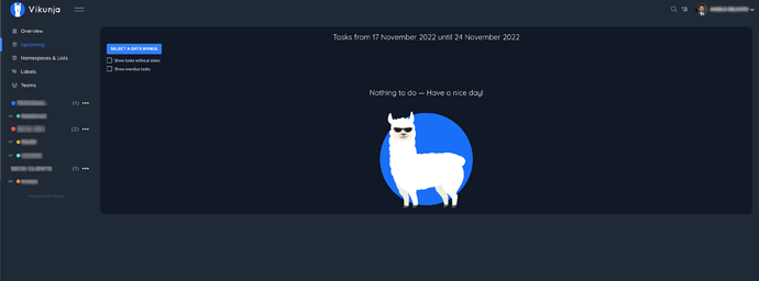
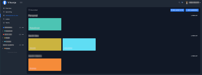
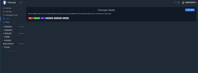
Hello, I’d like to suggest a little UI redesign and reorder. The app-content div is currently not uniformed. There is a page with the title and text centered, another page with the text on the left.
A good UI should have a defined structure and stick to it. Also I think that it would be much better if the content was wrapped inside a card-like structure to make it stand out.
Here are some screenshots of what I’m talking about (the same applies for the Light mode with white cards):
(sorry I’m not able to upload more than one media per post).
If you like it I’m perfectly capable of implementing it myself, but since you said (on Matrix) that for big changes it is better to come here first, here I am. Let me know what you think.
Hi @thelicato,
thanks for your suggestions. I mostly agree with your critic, especially regarding the alignment.
Also I think that it would be much better if the content was wrapped inside a card-like structure to make it stand out.
Personally I’m not a big fan of having unnecessary wrapper around content. What I do agree though is that especially the dark mode could still be improved to provide better contrast. When you check out your screens in light mode you will see, that some of the elements already do have wrappers. They only have the same color as the background in the dark mode.
We do plan to fix these kind of issues over time, but we still have lot’s of other more general issues on our plate that I would like to tackle before. To give some idea, what I mean by this:
- We depend on bulma which basically stopped being improved. In order to implement the dark mode we switched to bulma-css-variables which is a bulma fork that adds css-variables support. The fork is not continued but the fork author continues it’s work with a improved version called bulvar. I tried to switch to bulvar, but we had too many problems. Maybe this is worth a try again after the stuff in the following points is finished.
- Our styles were originally in style files and not directly in the components where they are needed. We did mostly untangle this, but there are still some global styles left that are very hard to untangle, because it’s hard to understand, where they apply.
- Our styles were deeply nested. This has a (for css) big performance impact but mostly makes maintenance of the styles really complex. Since the styles are now colocated in the components and we use scoped styles, we are now able to unnest them as much as possible, which we are already in the progress of doing. In an optimal case we’ll mostly have one-level class definitions as a result.
All of this stuff is happening in the background, it’s a lot of work, but sadly as a user of Vikunja you don’t see anything  , because these kind changes are only change the code organisation.
Having a design background myself I really hope like to improve the overall design of Vikunja in the long term. I think it has a solid base, but like you mentioned there is a lot that can be improved 
One last note regarding what you called ‘defined structures’: We have cases in Vikunja where we use the same kind or similar elements on multiple pages but don’t reuse them. I want to change this. As an example the headers bar, that includes e.g. the filters in the different views, look too different. They could share the same foundation and then diverge if needed for the specific view.
Have you ever though about moving to TailwindCSS? I use it for almost every UI I make and I absolutely love it.
Regarding the “card-like” style would it be okay with you to have another setting that allows the user to choose the style they want? In this way I can use the card-like style and you can keep this minimal style.
Of course I can implement it and make a PR, but as I was saying before I wanted to talk with you before starting the implementation.
Personally I‘m not a huge fan of Tailwind. I know it has its benefits, especially when working in a larger team, but currently we first need to tackle the stuff outlined above
Regarding the “card-like” style would it be okay with you to have another setting that allows the user to choose the style they want?
We are currently missing an api for these kind of settings (we really need this and have it on the roadmap). But even if we would have it I would hesitate to add too many user settings if not necessary. Not everything has to be configurable if there is a sane default  That said I‘m always open to improve the current implementation. Could you describe in more detail what you would like to change with the card styles?
1 Like


