Hello!
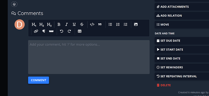
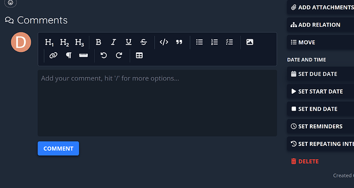
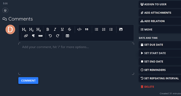
The comment box element is impossible to distinguish from the background. You have to know it’s there-- I see the formatting controls but having no way to immediately visually distinguish the text field from the backgrounds adds unnecessary cognitive load until you’ve spent a while with the interface, and I don’t see the benefit of it. I’ve done a bit of interface design and understand the balance between visual structure and visual clutter, but I think this adds beneficial visual structure that helps users visually orient themselves in the interface using layout paradigms they’re used to.
I am happy to contribute some ideas if there are other considerations this would clash with. Screenshot attached with what I’m proposing. Obviously it would change from theme to theme, but in this case, I just set the div to rgba(255,255,255,.125) and added a 1rem margin at the top.


