Purpose of the Overview Page and Tasks That Matter *Today*

Vikunja is a great project and I’m currently considering migrating from Tracks, which I’ve been using for the past 10 years.
But I think the current overview page, or the workflow for tasks that are important today could be improved.

The Problem

There is always more I could do than I actually do, so the list of tasks tends to grow over time.
As a result, it can be really overwhelming when you are greeted with a page that shows 200 tasks that is stored somewhere in the system, opposed to the ~10~20 tasks that are really important today.

Tracks’ Solution with respect to Vikunja

Tasks in Tracks have two dates, a “due date” and a “show from date”.
This is very similar to Vikunja’s “Start Date” and “Due Date”, but “Start Date” is more about tasks that have a duration, rather than hiding tasks that only become relevant in the future.

On Tracks’ first page you see all tasks with a “show from” date that is either unset or is in the past.
All tasks with future “show from” dates are hidden by default.
This is greatly reduces the number of tasks you see on your todo list each morning.
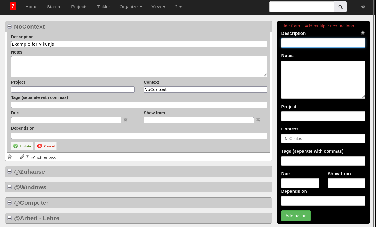
This could be achieved by setting start dates for all tasks in Vikunja and using a “startDate<now” filter.
In the demo I didn’t find a way to permanently set a filter for the Overview page though.

With such a workflow it also becomes important that you can quickly set a “show from” date for many tasks in a list.
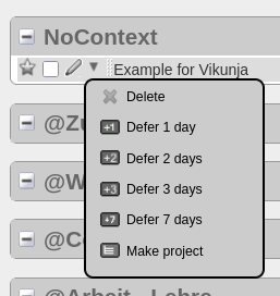
In Tracks there is a simple interactive drop-down button next to each task with the options “Defer 1 day”, “Defer 2 days”, “Defer 3 days”, and “Defer 7 days”.
Vikunjas “Start Date” drop down is actually much better than this, offering more options and showing a small calendar to pick a specific date.
But it is not accessible from the task list, and this would also abuse the concept of a tasks with a duration and a set “Start Date”, opposed to a “show from” date.

In my daily routine in Tracks, I open the “Today” page and defer any task that I don’t want to see for the rest of the day.
The “drop-down and defer” workflow allows me to quickly decide what I want today to be about, and I can decide when I want to see that task again, when it might be more relevant to revisit it.
After all these years I really think that this is reducing stress and overwhelm and makes me more productive with managing my tasks.

A Proposal

So to outline a different approach in Vikunja and open the discussion about it, how about this:

  • The “overview” page stays as it is, since it is useful to have a “show everything” page
  • But it moves to the second position in the sidebar
  • Maybe add the “Filter” button on the top right also to the Overview page? (At least I couldn’t find it in the demo)
  • The new default home page is a “today” page, with the purpose to manage any task that might be relevant today (could also be called “home” or “now”, …)
  • Tasks might need an extra “show from” date. Or do we start abusing “startDate” for that purpose?
  • Task lists, especially on this new “today” list get a new quick-set button for this “show from” date
  • Keep the “Add a task” field at the top of the new first page. (Maybe also on the Overviwe page?)

There certainly are implications and decisision of how to handle such a “show from” date for tasks in other views.
I think the different project views should ignore such a filter by default and show any task related to the project.
These pages are to think about all tasks related to a certain activity.

It also feels like this would tightly couple to the existing filter system and it’s more about reevaluating the purpose of different pages/views and which default filters might be useful there.

Possibly Related Discussions

There are a couple of discussion in the past that already touched on these ideas, be it by setting a custom filter for the overviwe page (“Customization Overview Page”), or a discussion on “Hide tasks where Start Date is in future”, which is basically the filter idea again.
“Better ways to show Current Tasks” is another topic discussing filters for the overview page.

Also setting the default due time to the end of the day (“Default Due Time”), a “show from” date would be most useful for the beginning of the day (maybe 0:00, maybe 6:00?).

“Overdue tasks persistance” - is discussing the purpose and look&feel of the default pages on the sidebar.

Welcome! :waving_hand:

I like the idea of a “show from date”. I think there was a similar proposal here in the forum in the past.

Using the start date in Vikunja could be a good workaround, though you’ll need more clicks to change it.

There is a way to do this, in the user settings (click on the avatar on the top right, then on Settings), then in the General Settings section there is an input Saved filter used on the overview page. This allows you to set a saved filter for the overview page. The setting will only show up when you have at least one saved filter though.

In the list view, you can click on a due date to defer it with the date picker. Not quite what you mean, but already something.

Thanks for your detailed proposal! I can see that we’ll implement something like this at some point, but maybe not as a default for everyone. It should be easy to customize Vikunja to that though.

2 Likes

Modifying the due date is actually exactly how I imagine to set a new “show from” date for tasks in a list. The only difference is that there are tasks that have a due date (e.g. “Buy birthday present for grandma”), but I might not want to deal with it today. Changing the due date would be wrong, the birthday stays the same. But I also can’t filter on the due date to not show it today, if I know I won’t find the time today.

Thanks for pointing out the saved filter option for the overview!
Filtering on the start date is almost exactly what I’d want, except that I can’t quickly change it for items in my list.

Would it be feasible to “just” add an option to allow for a Start Date modification similar to how it’s done for the due date right now?

I’ve added the start and end date properties originally to note when a task will be done - that sounds like what you want to achieve with the show from date.

Probably, but I think the UX is tricky to get right. What does this look in Tracks?

Tracks is just offering buttons to interact with tasks. A star to highlight, checkbox to check it off, pen to open a bigger edit window (but staying on the same page) and a mouse-over drop down that appears if you hover over the arrow.

I get that the UX in vikunja is different. The due date takes more space and adding a start date would make things more crowded, especially for a responsive design on mobile etc.

This is how it looks when clicking the pen for a task:

I think it’s useful to stay on the same page for quick edits, but the look&feel is a bit dated.
The only UX benefit I see is that you can change the task properties on the same page.

Do you feel like it should always be buttons? Or should we just show the date in the row, similar to the due date? (If we do that, how could we distinguish the due date and the start date?)

We actually had this quick edit pane on the side a long time ago. We’ve removed it at some point because it was getting too crowded and you’d need to maintain essentially two views doing the same thing.

Not necessarily. Showing the date in the row, similar to the due date would be fine if the UI leaves enough space for it in all presentations! I like the UX of changing the due date as it is right now, but the line could become too crowded if more things go in there.
This is likely why Tracks ended up with buttons to modify tasks in a list-view.

Interesting! I agree that it is important to have a clean UI and it’s not great to have to maintain redundant implementations. Feels like one definition of technical debt.
On the other hand: If it’s the main purpose of the list view to edit task, then one could argue in favour of reducing the amount of clicks & mouse pointer travel distance and show the options on the same page, instead of a sub-page.

I don’t intend to be overly critical here and I’m aware that I am a newbie raising fundamental UX design questions, which is of course not easy to address. :slight_smile:

In terms of the number of clicks, that’s the same whether you’re editing in a side panel or on a separate page - it’s always one click.

No worries! What you say makes sense.

I think we could add the start date to the task line, but we need to find a way to distinguish it from the due date and we should avoid making the line too crowded. But if we solve these two problems, I think we’re good to go.

1 Like

Sounds like a great plan!
In the meantime I’ll set up my own vikunja instance and play more with filters and due dates to give it a proper testdrive.

Thanks again for the great project and discussion!

Awesome, looking forward to what you think of it after a while.

I found the time to set up my self hosted instance and the docker compose is really smooth to set up.

While playing more with filters and using the dueDate in the meantime as a workaround, I noticed another UX aspect that we didn’t discuss in this context yet:

When updating the due date (or future “show from” date equivalent) in the overview list, would it be possible to trigger a reload of the filtered view? Otherwise the task would still be in the list, unless reloading the page manually or going to another page.
Ideally this wouldn’t trigger a reload of the whole page, but reset the current list of visible tasks or just make the item in question disappear, if possible.

This is slowing down the process of quickly deferring and sorting todays tasks.

You mean using the Defer date popup? IIRC this is already happening, but maybe not when a custom filter is set.