Hi!
I have a case where I want to use Vikunja where most users are on mobile. The PWA works great and feels almost like a native app, nice work!
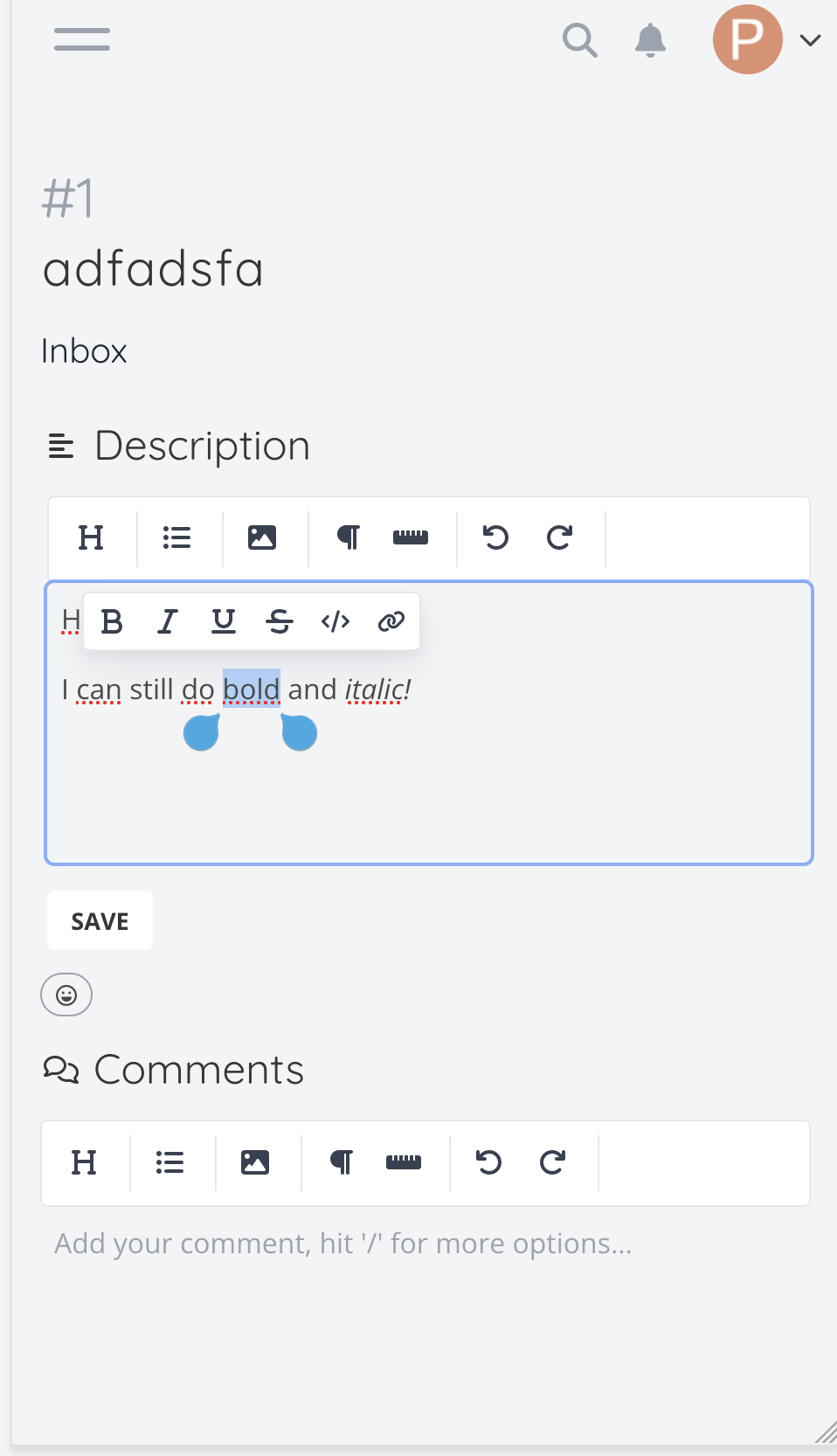
However, the toolbars in the editor gets very cluttered on mobile. I’ve looked at the editor and noticed that it has a “bubblemenu” component, that allows most, if not all, formatting options that are relevant on inline text (Bold, italics, etc).
So I’m wondering if you think it would be a good idea to make the editor toolbar contain fewer elements, at least on mobile. My idea is something like this:
Where the “H” contains a dropdown menu with the headings. I’ve removed the buttons for the things that are available in the bubble menu. For the list button I also imaging a dropdown with the different list types.
What do you think?
Would you change this in general or only on mobile?
I’m unsure how good that works on mobile because on Android, you get text options from the OS when you select text - these might interfer with the bubble.
I would prefer to have them the same on mobile and desktop, but I would be ok with both.
The BubbleMenu is already there, so any Android related issues should already be present. The only thing I’ve changed in my screenshot odd removing some items in the toolbar. The BubbleMenu isn’t touched.
Hi,
Yes, I think It’s a great idea to streamline the editor toolbar for mobile users in Vikunja. Reducing the number of elements in the toolbar can improve usability and declutter the interface. Utilizing the “bubblemenu” component for inline formatting options like bold and italics would keep essential functions accessible without overwhelming the user. Implementing a simplified toolbar on mobile could enhance the overall user experience, making the PWA even more efficient and user-friendly.
Thanks