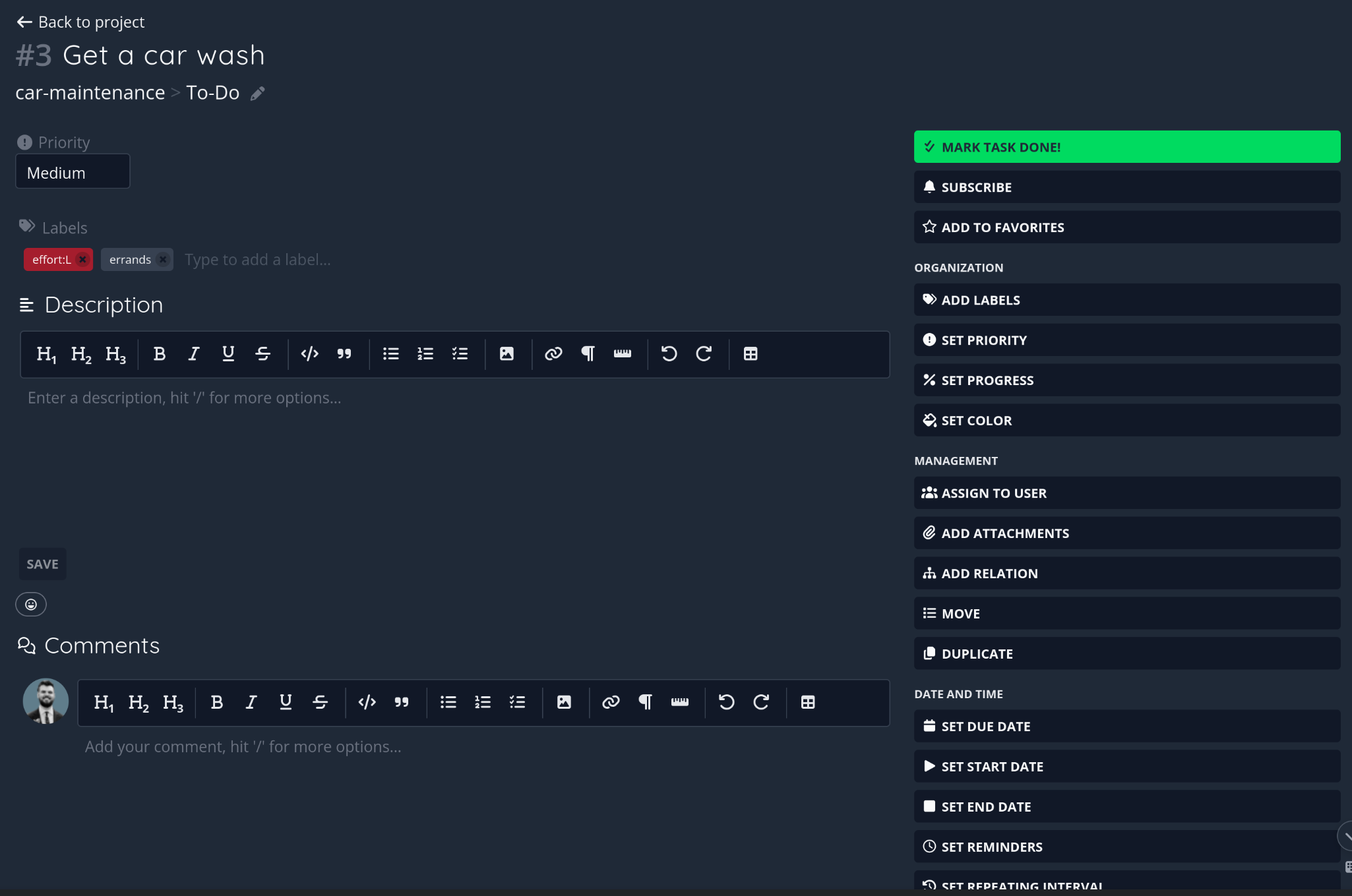
Opening a task and wanting to set a priority, the natural thing to do is click “Set Priority” in
the sidebar. That doesn’t set a priority — it reveals a Priority dropdown somewhere else on the
page (top of the content column), which you then have to find and click again. Same story for
Progress, Color, Due/Start/End date, Reminders, Repeat, Assignees, and Labels: nine or ten fields
where the sidebar button’s only job is to unhide a control you still have to go operate
separately.
Two knock-on problems from that:
- The page reflows every time — clicking one of these buttons pushes Description and everything below it further down, so the layout visibly jumps.
- The button never shows that you already clicked it. Set Priority and Add Labels look identical whether their field is empty, already filled in, or was just revealed two seconds ago. On a task with several fields set, you end up with a sidebar full of buttons that all look actionable but most of them do nothing anymore.
Combined with the “action” buttons that are genuinely one-shot (Duplicate, Move, Delete, Add
Attachments, Add Relation), a task with a few fields set can have close to 20 identically-styled,
full-width, uppercase buttons stacked in the sidebar. Nothing distinguishes “click this to act” from
“click this to reveal a thing to then click.”
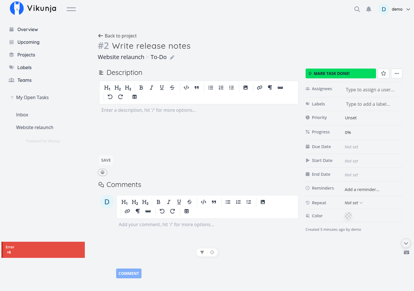
Screenshots: shows the reflow and the two new field blocks that appeared above
Labels while the sidebar buttons themselves stayed put.
Proposed change
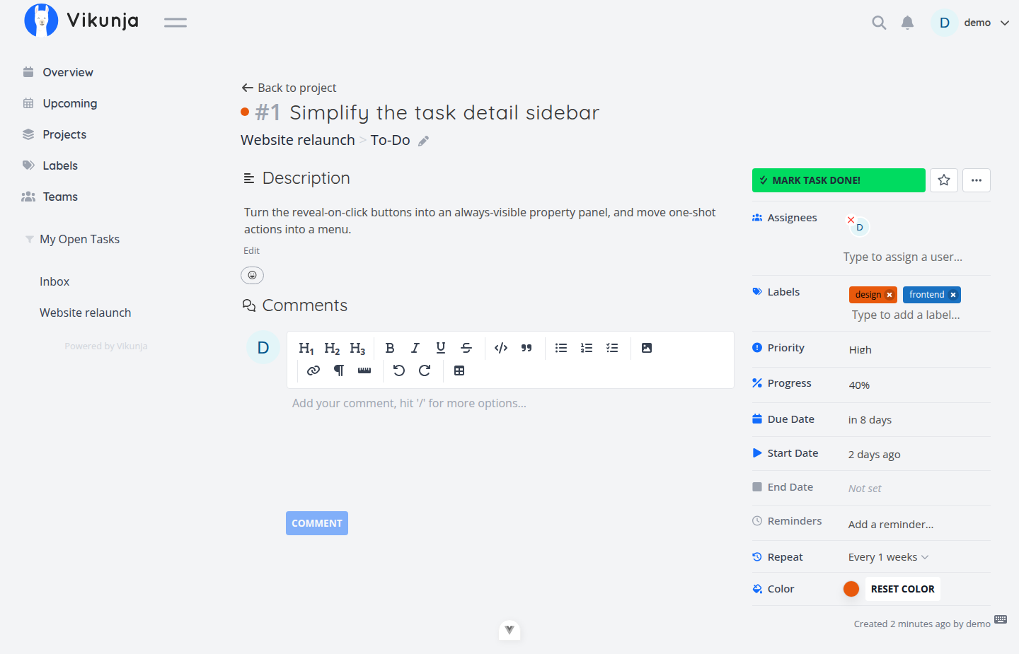
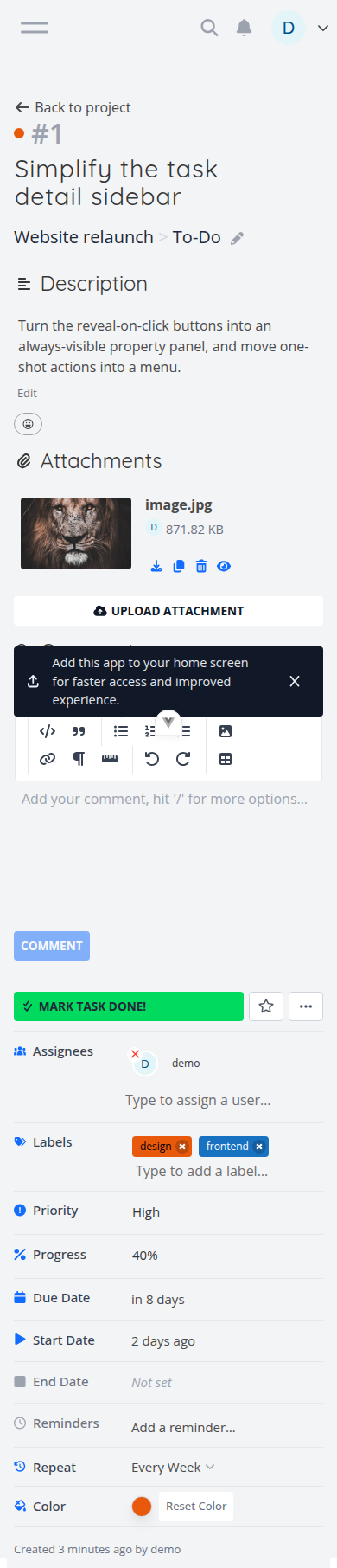
I propose splitting the change into two parts. We will move value fields to the sidebar, leaving action fields in place.
Change 1 - Value Fields
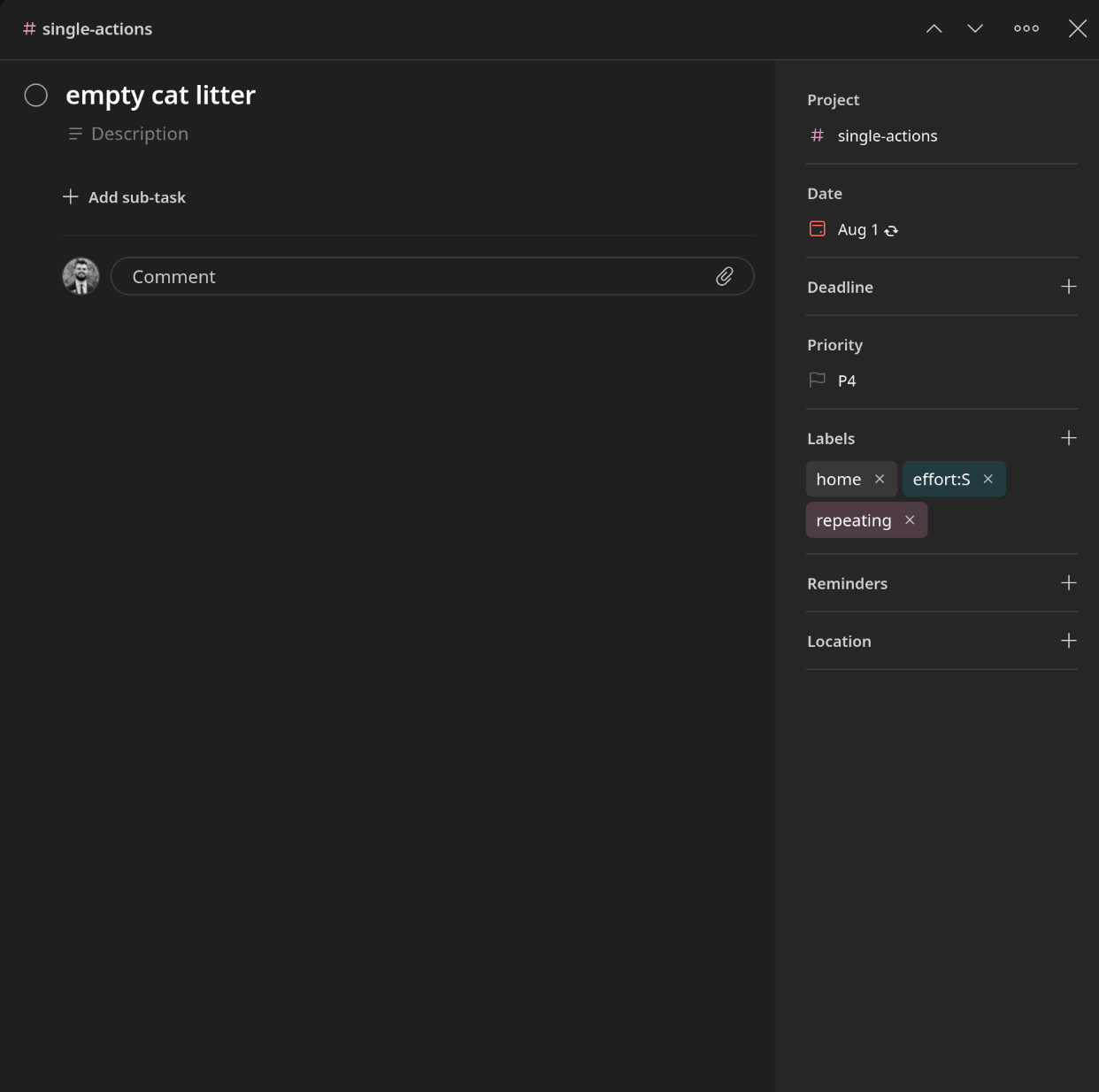
For fields that have a “current value” — Priority, Progress, Color, Due/Start/End date,
Assignees, Labels — show them as compact, always-visible rows with their current state
(Priority: Unset, Due date: —) that you click to edit directly in place. No reveal step, no
button that goes stale after one use, no reflow. This is roughly how GitHub and Linear handle
issue sidebars. See Todoist Task Detail:
Change 2 - Actions
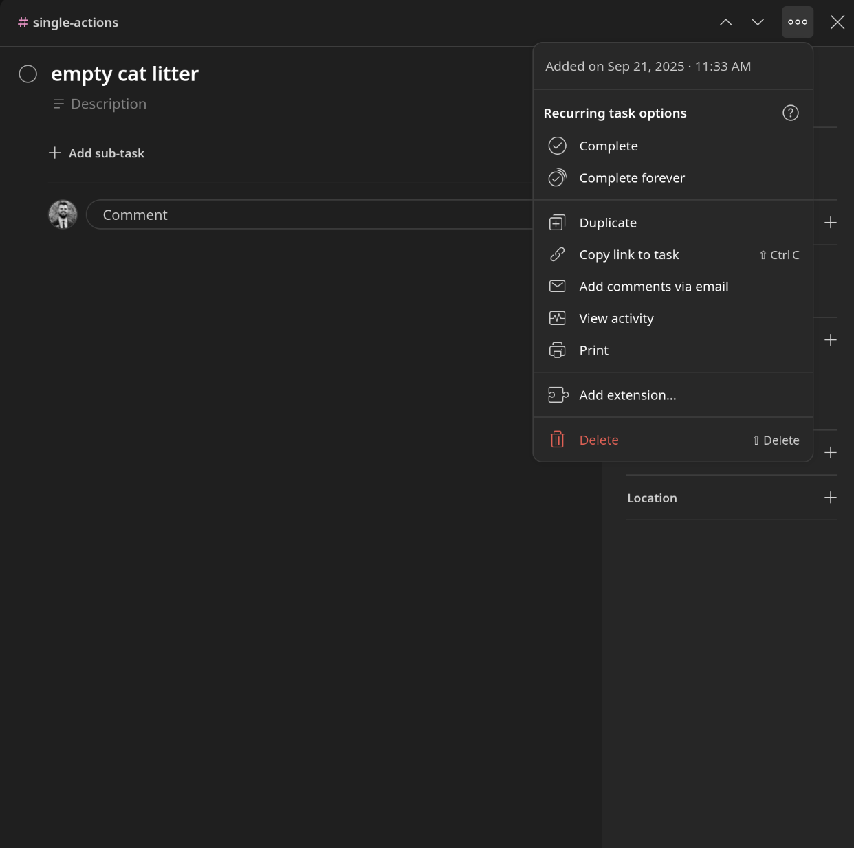
That leaves actions that are actually actions: Mark Done, Subscribe, Favorite, Duplicate, Delete, Add Attachments, Add Relation.
I propose moving those to a Ellipsis menu a la Todoist. I believe this also establishes a clean precedent for adding these actions to all Task Lists as well in other locations if desired.
Another Note On This Area
Smaller, separable change: the sidebar buttons and group headers (Organization / Management /
Date and Time) are all uppercase. With this many buttons on one page, uppercase stops reading as emphasis and just adds noise — sentence case would make the list easier to scan. Fine as its own small PR regardless of what happens with the bigger change above.
Scope
Task detail page only. Not proposing any change to how tasks show their metadata in List, Table,
or Kanban view.
Question for the thread
- Is restructuring the sidebar into an always-visible metadata panel a direction that’s welcome, or is there prior discussion/reasoning behind the current reveal-on-click pattern?