First I want to preface the message by stressing I’m not trying to complain, but to share a poweruser perspective I hope could be helpful in making Vikunja the best-in-class product that it easily could be.
Context: I’m a software engineer with over a decade of experience using different project/task management tools - Trello, Jira, Monday, Workflowy, Wunderlist, Google Tasks, Linear, Todoist, Notion (currently using the last two for my personal stuff), and in this time I had the opportunity to see what’s lovable about these tools and what’s a pain-point discouraging people from using them.
I recently deployed a Vikunja instance - it genuinely looked like it was the only tool that could check all the boxes for me. And what I found is that it’s tantalisingly close to that - I appreciate the design philosophy, it has all the features I’d need.
But what stops it from being the tool I move to (and push everyone around me to use), is just a little bit of missing UX polish that makes the user experience much worse than what it easily could be. Let me give some examples:
Quick add (magic) flow
Vikunja has the Todoist-like quick-add keywords (even with the Todoist-syntax mode, much appreciated), but the way it’s implemented makes it much less pleasant to use than the Todoist version.
There’s no visual feedback as you’re typing in the task, so it’s up to you to double-check you used the syntax right - you only see if the results are what you wanted after you create the task. So one tommorow instead of tomorrow and you end up with a task with no deadline and a malformed description that you’ll need to change in the task edit screen. To contrast it to how it works in Todoist:


The feedback is instant (so you don’t make mistakes), there’s tab-completion, and the magic keywords support abbreviations, so there’s a good incentive to use them
The task list view
I don’t mean just the list view - what I mean also applies to the table view, kanban view, and for the most part, the gantt view as well.
Once you’ve created the task using quick add, there’s no easy way to edit it without entering the task edit screen. This is an issue for a number of reasons - the task edit screen workflow is slow, you lose the context of seeing the other tasks (what was the related task called again? When was it due?) and it takes you out of the flow. The UX potential is pretty much wasted - you can change the deadline of a task (but only if you set one in the first place), and the “hover” popup serves basically no purpose (apart from letting you know what the task id is).
Again, contrasted with Todoist (sorry about using Todoist as the only reference, it’s what I have open right now):
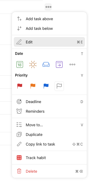
There’s some drag-and-drop functionality here, but it’s very underutilised - you can reorder the tasks or move them between projects, but you can’t convert a task into a subtask or mark another relationship - all of that you do in the task edit screen
The task edit screen
There’s nothing inherently wrong about it, but takes the oldschool Jira approach of overwhelming you with options (even if your organisation doesn’t use half of them) and most flows take more clicks than they could.
The task relationship feature (once you click to show its ui) doesn’t show any suggestions in the dropdown-style ux unless you type something in it - so you better remember what the task was called. It could just as easily show the recently created tasks in the project - in a similar way that assigning a user shows you suggestions before you type anything in. Plus the direction of the relationship is non-obvious - but that’s a common issue in other task management tools as well
I’m picking on the task relationships because they’re the feature that Todoist is missing for me - I’d be happy to bolt-on some critical path visualiser using the API Vikunja provides, but with this UX for defining the relationships I’ll be too frustrated defining them before I get to that point
Other
There are other aspects that would really benefit from some attention from a UX-focused designer and a decent FE dev, I just focused on the ones that jumped out the most.
I could have probably saved myself a click here or there using the keyboard shortcuts (and I’m all about the keyboard shortcuts), but I’m not at the stage where I’d want to commit them to muscle memory.
Scope
The best part is, all of it could (probably) easily be implemented with frontend-only changes, without changing anything about the data model or maybe even the internal APIs! That’s the part that made me write the post in the first place - if y’all could find the resources to improve the UX a bit, Vikunja could basically overnight become the best tool on the market for a segment of users
I’m a bit worried that this whole post might be taken as hostile criticism or with “learn to use the tool, dumbass” energy. I have been on the internet before, so it wouldn’t surprise me and I won’t waste energy trying to argue with people.
I see a lot of potential in Vikunja and hope feedback like this one could make it achieve its tremendous potential.
I’m also ready for the “talk is cheap, how about you make a PR instead” response. I honestly considered that, but:
- I’m very much a backend engineer and I’m not sure my underinformed approach to FE would provide the most value
- The decisions about UX are best if made with some coherent vision in mind, by a person empowered to push the changes through, not random people trying to tack on things they think are good
- I already have plenty of non-paying work to do either way - I wanted to use Vikunja to coordinate it better and focus on my C/Golang, not get lost in a javascript sidequest

I wish I could contribute more, but writing all of this up already took more time than I had planned 
Anyways, thank you for making this impressive open-source project and fingers crossed for the company’s future!