I find it quite annoying that if you just want to see the last bucket, you scroll all the way to the right, then you have to scroll one column back to the left, especially on mobile. Given that people don’t create new buckets very often, I think it’s a waste of space.
Maybe moving the button alongside the “filters” button could work. Maybe make it configurable, maybe at least per-project.
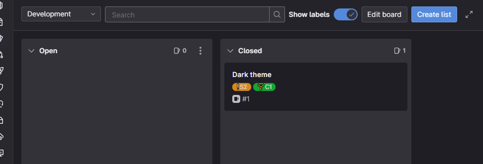
See how GitLab does it: