Perhaps it’s my inability to name things creatively, but I have a “General” list in more than one namespace. It would be cool if the assigned coloured dot for the list appeared at the top of the screen alongside the title. Perhaps also even the namespace (or parent project) should appear before the name of the list so that some context of where the list sits in its hierarchy can be seen.
i.e., We see namespaces and lists along with their assigned colours in the left-hand column:
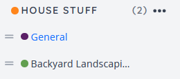
But on the top of the page where the title is shown, we see only the title:

Personally, I’d like to see House Stuff / General or something similar for the title of the list.